Sunday, 29 May 2016
Saturday, 19 March 2016
Toni Cogdell - Trace
My work
Original
Reflection - I have done a colour study. The original picture/painting is on top and it is called Trace. It was created by an artist called Toni Cogdell. The model on this painting is unknown.The artist who has created this is not a well known person ( not that recognized) there for I was not able to collect that much detail nor accurate information. For my colour study I was unfortunately not able to use the same materials as the original, this was due to not being able to work on a canvas and not being accessible of the materials nor do i known how to use them. In my colour study I believe I have not completly finished due to it not being my best work nor final out come and i could of changed or done some touch ups. I believe the colours I have used are pretty accurate. the techniques I have used mostly are strokes even though I believe i could of needed more blending to create a more faded effect. i believe it was hard since using dark colours which are harder to fix or work on top with. It was also a bit hard by using the printed image due to it being different colour and not looking like the original.
Experimenting with Carbon Paper and Printing Paper
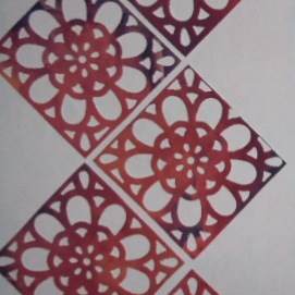
Reflection - I think using carbon paper was very fun and interesting. It was challenging at first because I had to make sure I didn't move the paper or the carbon paper but now i know for next time. In my first attempt everything went well but I have accidentally moved the paper which then lead to repetition. I just continued to do more repetitions and pretended I was planning to create this result. Eventually I think it turned out very good. For improvement I think I could include symbols.
Reflection - i think this method of using printing paper did not turn out as expected. I have used oil pastels to create this outcome. When experimenting with this I had to use force when pressing the pencil for the printing effect. I have firstly selected an image and then I have selected various of different of colours. I have tried putting them in a colour order scale. I believe this method was not as successful . I say this because when I have finished the print of the colours were not that clear but i can use this as an improvement for next time, to put more pressure in some areas where it is needed. Also I think I should of mixed the colours for better outcome. I should also make sure to start using the printing method right after the oil pastels have been used at the back of the image otherwise the effect won't be as markable and will be barely noticeable. For now I will be experimenting with other methods.
Experimenting With Composition
In the first draft I have used oil pastels and colouring pencils. I have then used transfer paper to get a precise image of myself. For the symbols I have used coins ( Fr which are swiss and Dhs from U.A.E) This technique was inspired by my child hood since I have always used it. While using the coins they also represent me in a way due to me being from Switzerland and me living in Dubai. In my second draft I have used a marker/pencil and colour pencils. I overlaid a crab which represent when I was born. Which is in July, cancer is my star sign. I have also blended the colour pencils to create an ombre effect.
Monday, 29 February 2016
Frida Kahlo Colour Analysis
Self Portrait with Humming Bird Original Work
Process..
Reflection - I have created a colour study on Frida Kahlo's "Self Portrait with thorn neckless and humming birds". I have used oil pastels through out the whole process. I have firstly sketched the outline and then I have started off with the background. i believe the background turned out really good since the leaves are realistic looking and very detailed in colour. Then I have struggled with the face due to it having a small surface and working in tiny spaces. Also it became harder to find the right colours even with blending and mixing the colours. The face is poor in detail. Other than that my favourite part is the background due to the texture and the realistic look. For tones. I stuggeledwith the black monkey and the cat. When colouring these two animals, I started automatically with the colour black which was a mistake due to it not being able to create any shades and outline to give the animals more structure.
Sunday, 28 February 2016
Line Drawing
Without Lifting The Pen
This is a sketch we had to create without lifting our pens from the paper for 5-10 minutes. I believe I have not done a good job since I believe I have greater abilities. The improvements I could do the next time to create a better result is first creating the structure of a face/portrait to make it easier for me to work with. I think I should also use the space I had to make it more effective, detail and shading would also be clearer when doing this.
Subscribe to:
Posts (Atom)